
web menu - mobile experience
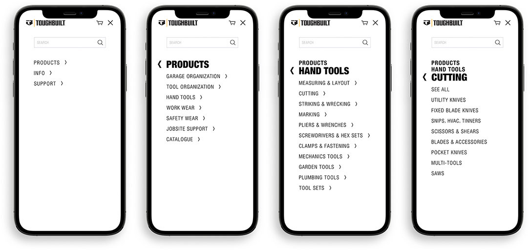
As ToughBuilt continued to develop the digital design language for the web menu system, it quickly became apparent the the desktop version was not going to work in the mobile environment.
Standardized icon interactions remain present, including an animated hamburger icon, but now category tiers react with an intentional tap rather than traditional hover-states.
The rest of the menu animates to accommodate these changes.
web menu - desktop experience
As part of the effort to introduce their new eCommerce website, ToughBuilt began to design a digital-first design language based on existing themes. One of the most front-facing and deceptively complex components was the menu system. The design brief required something fluid and straightforward, requiring minimal clicks to reach a destination.
Animation of the menu typography was the biggest challenge here and what really sets this menu apart from others. Watching the video you can see that as categories are selected the font goes through a transformation not only of scale but also of opacity and style...in this case Helvetica Light to Black.
made with: